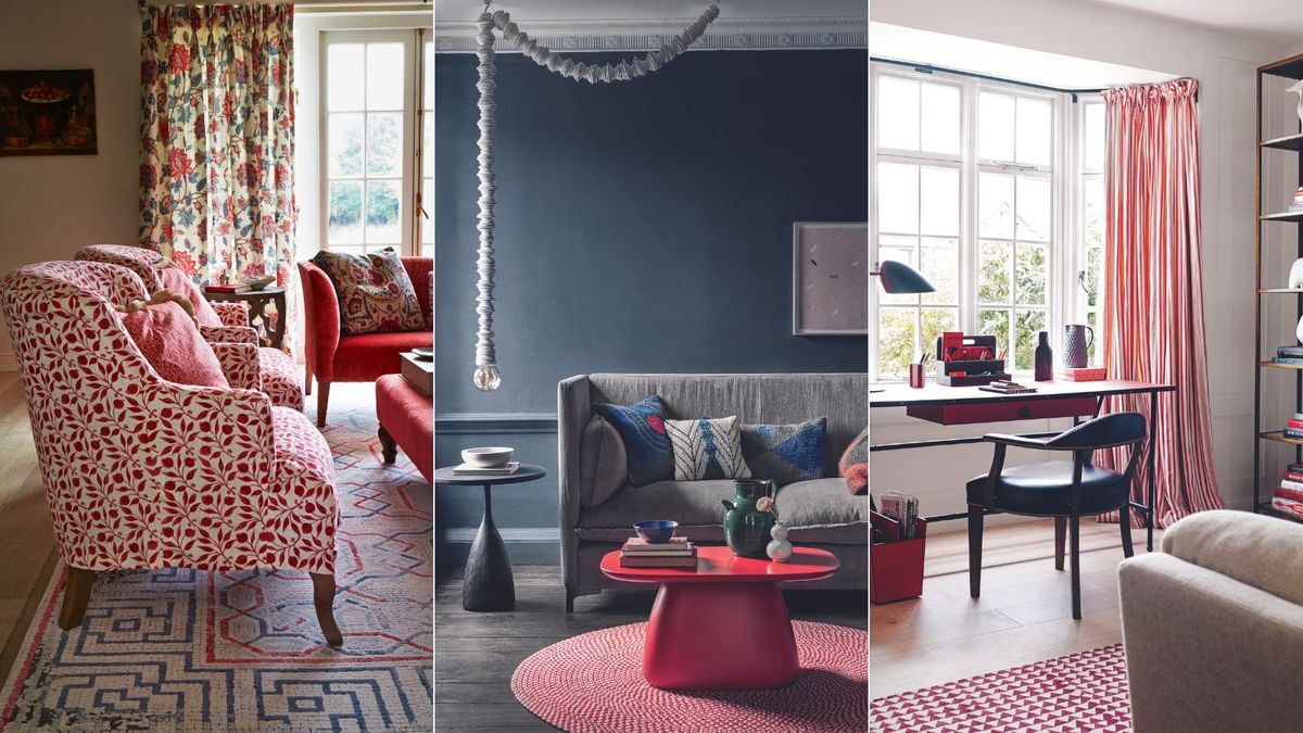
these are my color rules |
I’ve moved home multiple times as an adult, trading up from tiny, shared rentals, to a small apartment of my own, on to a cottage and, finally, a series of increasingly larger Victorian houses.
Every time, I’ve sought to make my living room the heart of my home – and, along the way, I have discovered that my living room color ideas are the key to that. Each time I move, I take the living room design lessons I’ve learned to my next home, and to those of my friends and family who ask for living room styling advice.
What’s fascinating about the color rules I adhere to is that they can be adapted to suit any style. No single living room of mine – or those I’ve helped others to create – has been the same color or, to a degree, style, though many pieces of furniture have remained the same.
I’m sharing the color rules I apply to my living room ideas here because they could be the key that helps you unlock your living room color frustrations. And, before you ask, yes, I’m pretty fixed in the order I apply them.

I have written about interiors, property and gardens since 1990, working my way around the interiors departments of traditional women’s magazines before switching to interiors-only titles in the mid-nineties. I have been Homes & Gardens‘ Global Editor in Chief for over two years, and this has given me access to some of the world’s best interior designers. Of note: I’m a serial renovator, so I put all the advice I’ve learned to very good use.
1. I ask myself how I want my room to feel – and make a mood board
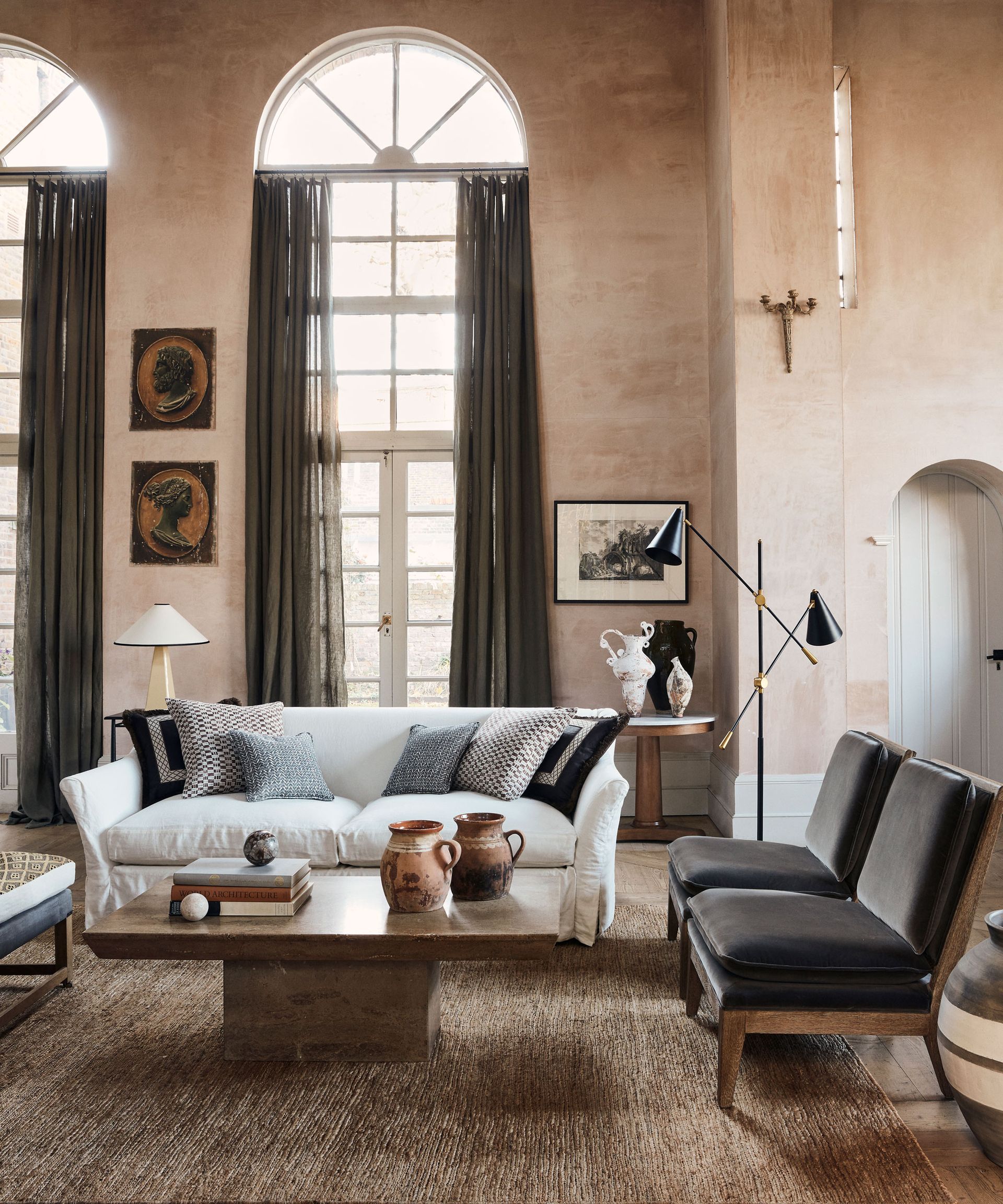
(Image credit: Jake Curtis / Alyce Taylor)
Cozy and inviting? Warm and welcoming? Cool and formal? Breezy and bright? The colors you choose can affect not just the room’s mood and how spacious or light it feels, but how you feel about it.
There’s no mystery to color psychology: some colors (such as yellow) make us feel happy, some (such as red) are said to induce stress, and others (such as cool blue) make us feel relaxed.
But – and this is vital – you have to factor in how individual colors make you feel and choose the ones you love accordingly. I favor lots of white layered with spice shades and touches of black – but that’s my taste, possibly not yours.
I find the best way to narrow down which paint colors to choose is to make a moodboard, whether by tearing pages out of magazines or by building one on Pinterest.
Unless you’re lucky enough to be replacing all your furniture with new at this stage, you’ll need to factor the materials and colors you’ll be bringing into the room as part of your moodboard.
2. I question the choice of color and its effect on my space
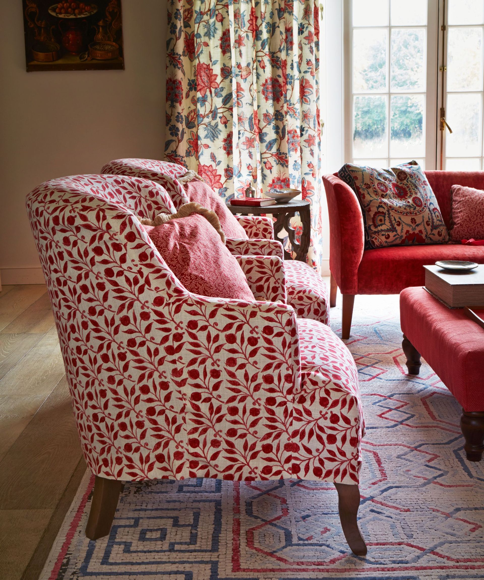
(Image credit: Future)
In making my moodboards, I have sometimes surprised myself by choosing colors that are overwhelmingly dark – even though I want the room to feel as spacious as possible. Or sometimes I’ve chosen bright whites but want the space to feel cozy.
In these cases, I’m forced to acknowledge that I may need to compromise – and perhaps you will too. Those darker colors I love may have to be used in smaller quantities, perhaps on a sofa or a feature wall, for example; or I may need to look at different ways to make a dark room feel spacious, by ensuring it’s not over-stuffed with furniture and benefits from streamlined living room storage.
Bear in mind, too, when narrowing down color choices, the time of day you are predominantly in the room. Any color you choose – light or dark – will look and feel significantly different on a bright, sunny day (lighter, more vibrant) to how it does on a dull day (grayer) or during a dark evening, by artificial light (darker, possibly yellower, more muted).
Once I’m happy, I move on to my third color choosing rule.
3. I settle on three main colors for my space
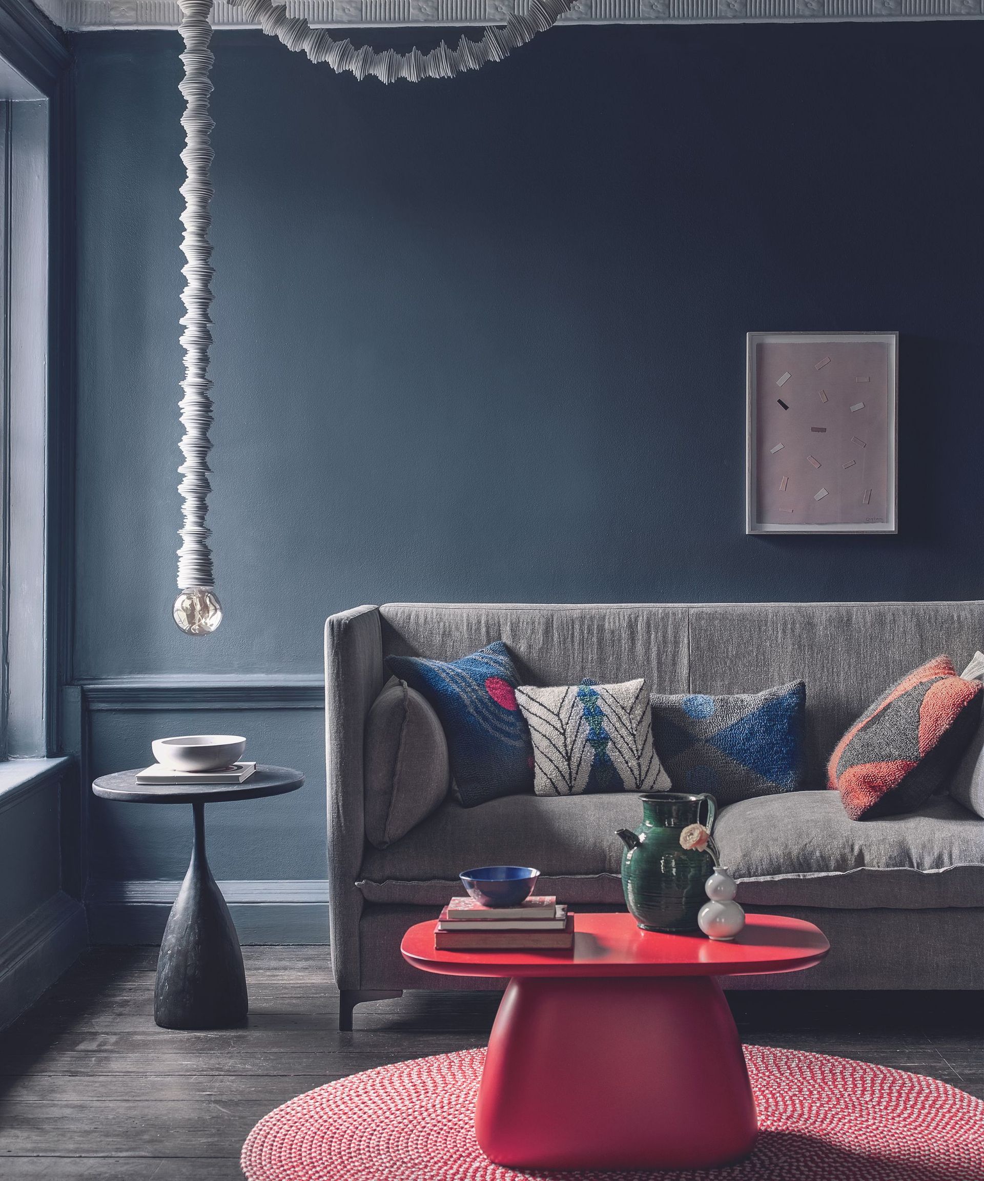
(Image credit: Polly Wreford)
Most successful schemes are made up of three colors: one is the main color; two others are accent shades. The 60-30-10 color rule is a great guide for achieving the right balance of proportions here.
4. I assess the room’s natural daylight to get wall color tones right
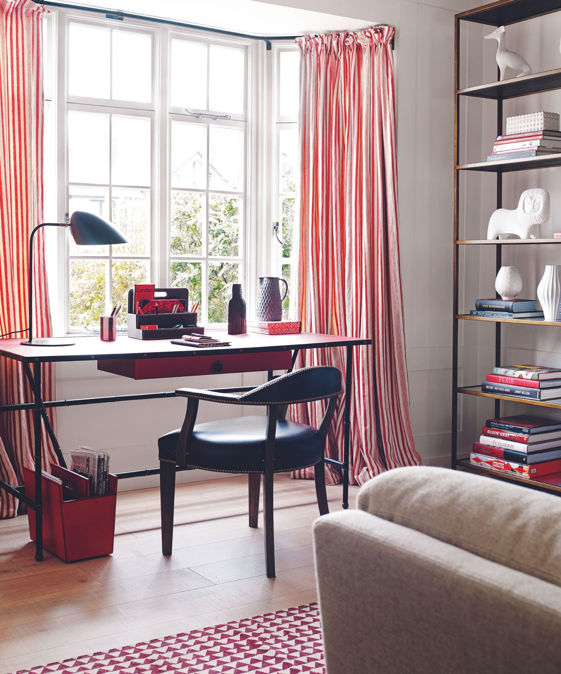
(Image credit: Carolyn Barber)
Assessing daylight temperature is where I always, always start narrowing down my color choices. Why? Because there’s no getting around the fact that the direction your room faces affects the color of the natural daylight that comes into it and, as a result, the way your living room colors look and feel.
And, though I’m not going into detail here, bear in mind that your window treatments’ thickness and colors will also affect the light cast into the space – thick living room drapes will dull light, while filmy, colorful living room curtains will tint the daylight that passes through them.
That consideration aside, I start with the walls, but I always consider ceilings and floors alongside them. More on these, just below.
It comes down to personal taste, but I would hazard a guess that most of us want to choose colors that make our living rooms to feel cozy. That’s easily achieved if your living room windows face south or west. But if they face east or north, and receive cooler daylight, you will need to adjust the colors – or to put it more accurately, the tones – you choose to warmer ones.
This doesn’t need to be over-played: I’m not suggesting painting walls in a north-facing living room bright yellow if you want a neutral scheme – the adjustment of tone could be as simple as choosing a white wall paint with the merest hint of creamy yellow over one that’s pure white. Or a blue that has a hint of yellow rather than a tint of black. Do so, and a room that receives cool light will feel instantly warmer, even if it’s painted in a color that’s traditionally perceived as cool.
So, now I have an idea of the tones I might go for on my living room walls, and I can start considering living room paint colors or living room wallpaper ideas. But I won’t fix on anything just yet, because I’ll consider the tones of the ceiling and floor before I do.
5. I enhance the wall colors with the right tone for the ceiling
(Image credit: Meghan Eisenberg)
We all do it: obsess about wall colors and disregard the ceiling. But that’s a mistake I’ve made in the past, which is why it’s living room color rule number five for me.
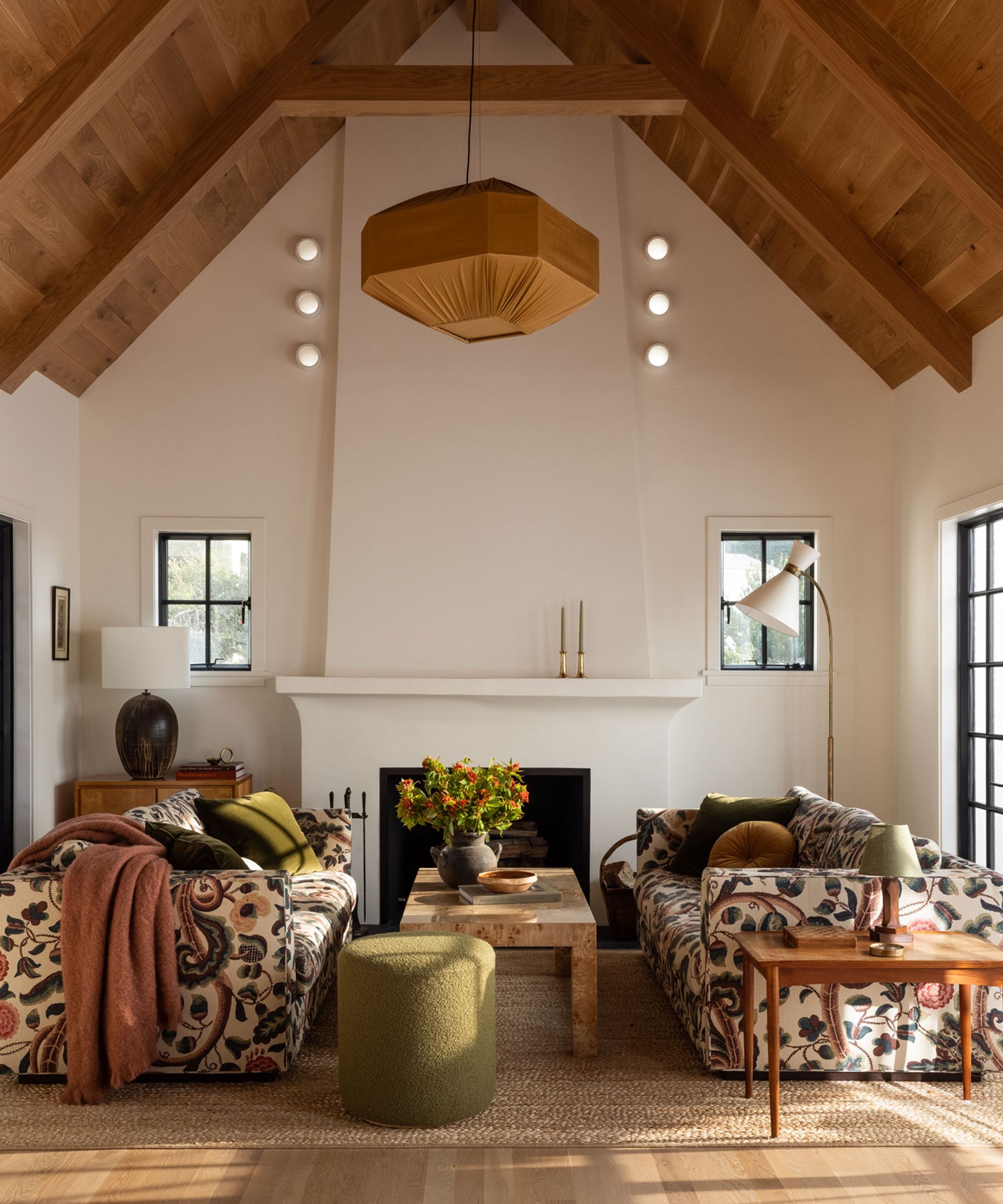
While white ceilings are the overwhelming norm, and perfect for making a small living room look bigger and airier, living room ceiling ideas have moved on somewhat in the past couple of years.
Using the room temperature rule I’ve applied above, I’ll consider the tones I might use on the ‘fifth wall’ of the space, and adjust to ensure that the color temperature is not only consistent from wall to ceiling, but also contributes to the overall room temperature – and therefore the mood – I want.
Let me give you an example. In my current home, I have two living rooms. One is south-facing, and therefore warmly lit. It’s the space we use during the day, and it’s a busy room. So I have painted the ceiling white to keep the room feeling as cool but bright as possible.
The other is north-facing and where we gather for movie nights, so daylight isn’t much of a consideration. The walls are a warm cinnamon, and a slightly lighter tone of that color is carried up on to the ceiling, which makes the room feel cozy and intimate in a way that white can’t.
Ceiling wallpaper has gained in popularity in the past year or so. I love it in small spaces (it has found its way into my powder room, for example), but I’ve yet to be brave enough to use it on a living room ceiling, though it can look wonderful – I’ll let you know when I do.
6. I create contrast with the floor color temperature
(Image credit: Lapicida Chianti Rovere wood effect floor tiles)
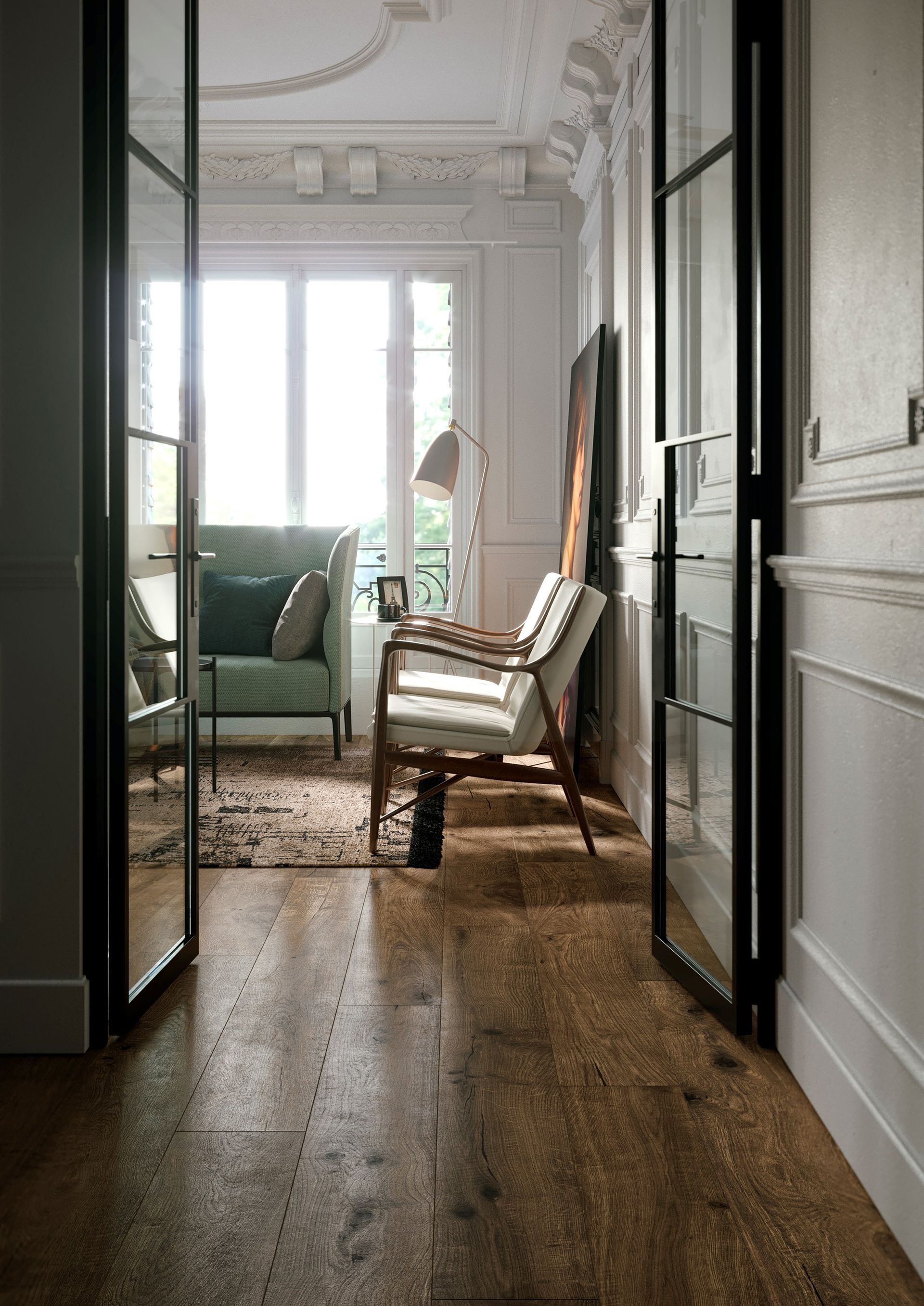
Next, I consider living room flooring. I tend to have wood flooring with an area rug over it because that’s practical for family life and I can switch out the rug when I want a new look. Plus, I like the visual warmth of the timber. But this color temperature rule is just as applicable if you are choosing living room carpet or tile.
The flooring color you choose for a living room creates much more of an impact on the overall appearance/mood/finish of the space than a ceiling color does, and interior designers will often tell me that choosing a rug is the starting point for their color schemes. It’s also a great way to add color and pattern to a plain room.
But, just as with the walls and ceiling, I like to settle on the floor’s color temperature before I get into detail. And this is where I attempt to achieve some balance.
In my main living room, I have a warm-toned wood floor with plenty of visible grain, on top of which is a natural sisal rug with a geometric pattern in warm paprika. These are specifically chosen to balance out the cool white of the walls and ceiling. However, in my second living room, which has dark, warm toned walls and toning ceiling, I have created balance with a very pale wood floor, and sisal rugs with touches of black.
Creating balance like this isn’t a hard-and-fast rule, but I find it works to make warm rooms feel a touch more elegant, and cool rooms a tad more welcoming.
A word of warning if you are choosing natural wood flooring: it changes color as it ages, usually darkening in areas not exposed to sunlight, and lightening in sunny spots. You may not notice the incremental change, but it’s worth taking into account.
7. I color swatch – on walls, floors and furniture
(Image credit: Alun Callender)
Colors and tones settled upon, I paint 1ft squares or pin wallpaper samples on all four walls, and I lay fabric swatches over sofas and armchairs. I even get hold of flooring samples and lay those down to create mini-recreations of what the room might look like.
I then live with the swatches for a week, observing them under all light conditions. Doing this gives me a really good opportunity to see the effect of my living room lighting on the colors. Different lightbulb colors can really effect how colors look: warm bulbs will make everything look yellower and warmer; daylight bulbs will make everything look whiter and a little starker. What you choose is down to how you want the room to feel – but it’s worth noting the effect of artificial light on your color choices.
I also use it as a chance to adjust the proportions of plains vs patterns, and main color vs accent colors so that the balance feels right. I use this as a chance to sense check the proportions of the accent colors, considering that I’ll be adding accessories into the mix later.
It’s also important to note the effect of the different textures you’ve introduced at this point. Does the texture of the wallpaper detract from that of the flooring, for example? Do you have too little texture? Or too much? This is the time to adjust.
8. I accessorize… but slowly
(Image credit: James Merrell)
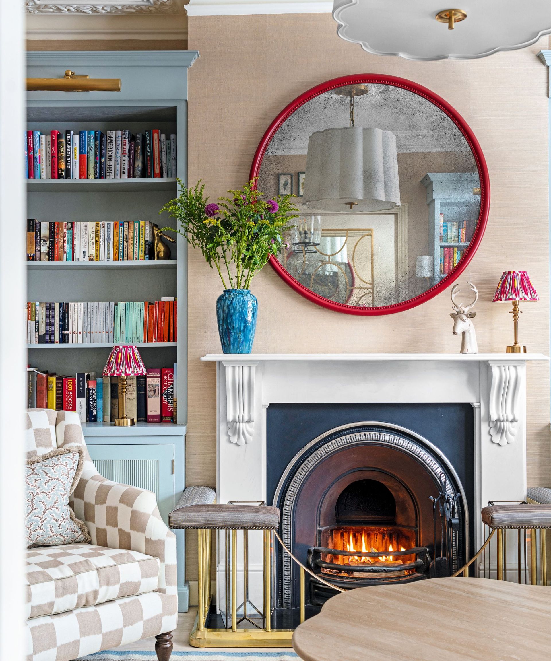
With the color scheme finalized, I’ll once more sense check the accent shades in fabrics, wallpaper and paint until I’m happy with the balance of tones and proportions. As I said above, I bear in mind at this stage that I need to consider accessories, which can include anything from smaller pieces of furniture, to mirrors, to pillows, to indoor plants, all of which can affect that delicate balance.
The next step is to get the room as complete as possible. Only then do I consider the finishing touches, and even then, these can come slowly. I think the best way to accessorize is organically, assuming you don’t want a carbon copy of the room you lived with before, in which case, you have your formula cracked. Otherwise, a slow, cautious approach will assure a room’s color balance doesn’t feel contrived.
So, I live with my fully decorated room and the most basic accessories for a few days before I begin to add in more – even if this means boxing up possessions I’d had in mind for the room beforehand.
What is the best color to do a living room?
This is my most asked question, and while it’s very much down to personal taste – it’s your home, after all – the most common answer I give is ‘warm tones’. This can range wildly from creamy whites right through to chocolate brown, and everything in between, but in every case, it will make a living room feel warm and welcoming, and you can temper it with cool blues or enhance the cozy factor with more spice shades.
What color is replacing gray in living rooms?
Believe it or not, gray living rooms aren’t as popular as they once were. I blame the pandemic – we are all seeking refuge from cool colors and favoring warmer ones: so, look to beige, or if you still hanker after gray, greige. Both are warmer than gray, while still retaining that go-with-anything neutrality that makes it such an easy color to live with and decorate around.

